Homey App
UX/UI Designer (Graduate Student)
Homey is a mobile application concept designed to connect newly homeless individuals with essential services and each other. As part of a graduate course project, I led the design and concept phases of a two-week sprint with a small team.
tools
Adobe XD, Adobe Illustrator
View prototype
The Opportunity
Easing the Transition for Newly Homeless Individuals
Homelessness affects over half a million people across the United States. For those experiencing it suddenly, the immediate challenge is not just finding shelter — it is knowing where to start. How might we use design to reduce the friction of that first, overwhelming transition?
The Solution
A Mobile Waypoint for Essential Services
Homey is a concept for a location-aware mobile application that connects newly homeless individuals to nearby essential services including shelter, food, and medical care. The concept operates under the assumption that the individual has access to a smartphone at the time of displacement, which remains a reasonable premise given current smartphone ownership rates.
The Process
Defining the Problem
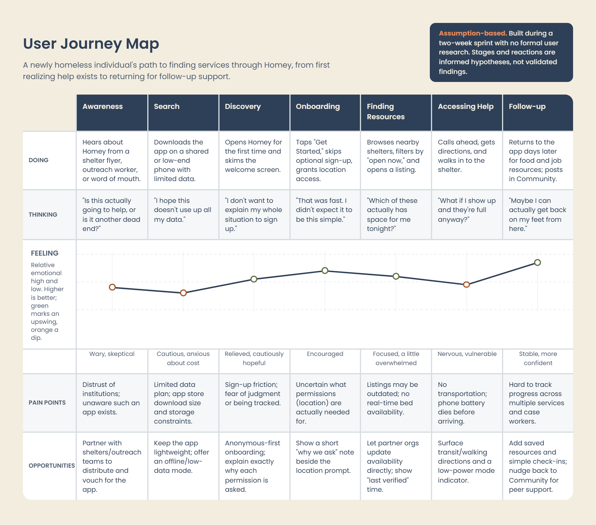
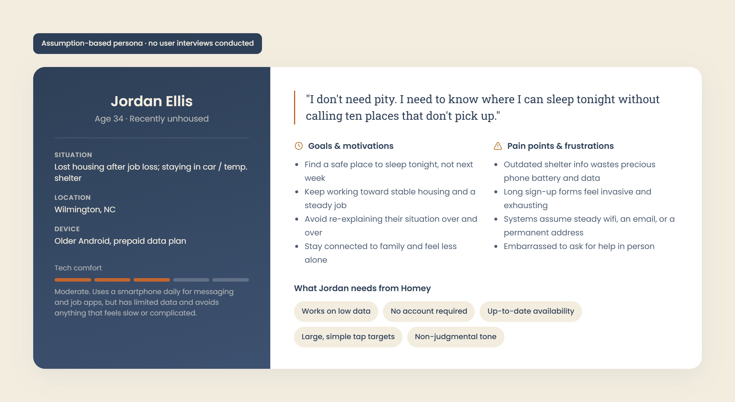
The challenges facing newly homeless individuals are immediate and high-stakes. Food, water, shelter, and healthcare are the primary essentials, and not knowing where to access them compounds an already stressful situation. Through a combination of secondary research and team discussion, we framed our core question: how do we get newly homeless individuals to the resources they need as quickly and clearly as possible?
Brainstorm and Ideate
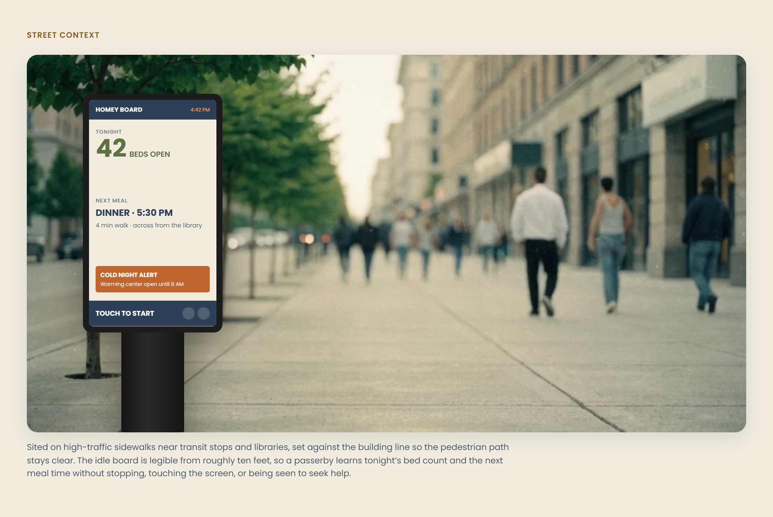
With the problem defined, we began exploring potential solutions. Two concepts emerged early: a digital kiosk and a mobile application. We moved forward with the mobile application, driven by the prevalence of smartphone ownership and the flexibility a personal device offers over a fixed kiosk location.
The core feature was location-based resource mapping. A user would be able to see nearby shelters, available bed counts, meal center hours, and food pantry locations at a glance. We also explored a community participation point system that would allow individuals to earn credits through local volunteer work, redeemable at participating vendors. After further discussion, we felt this feature risked distracting from the primary goal of the application at this stage and set it aside for a potential future iteration.
Design the Interface
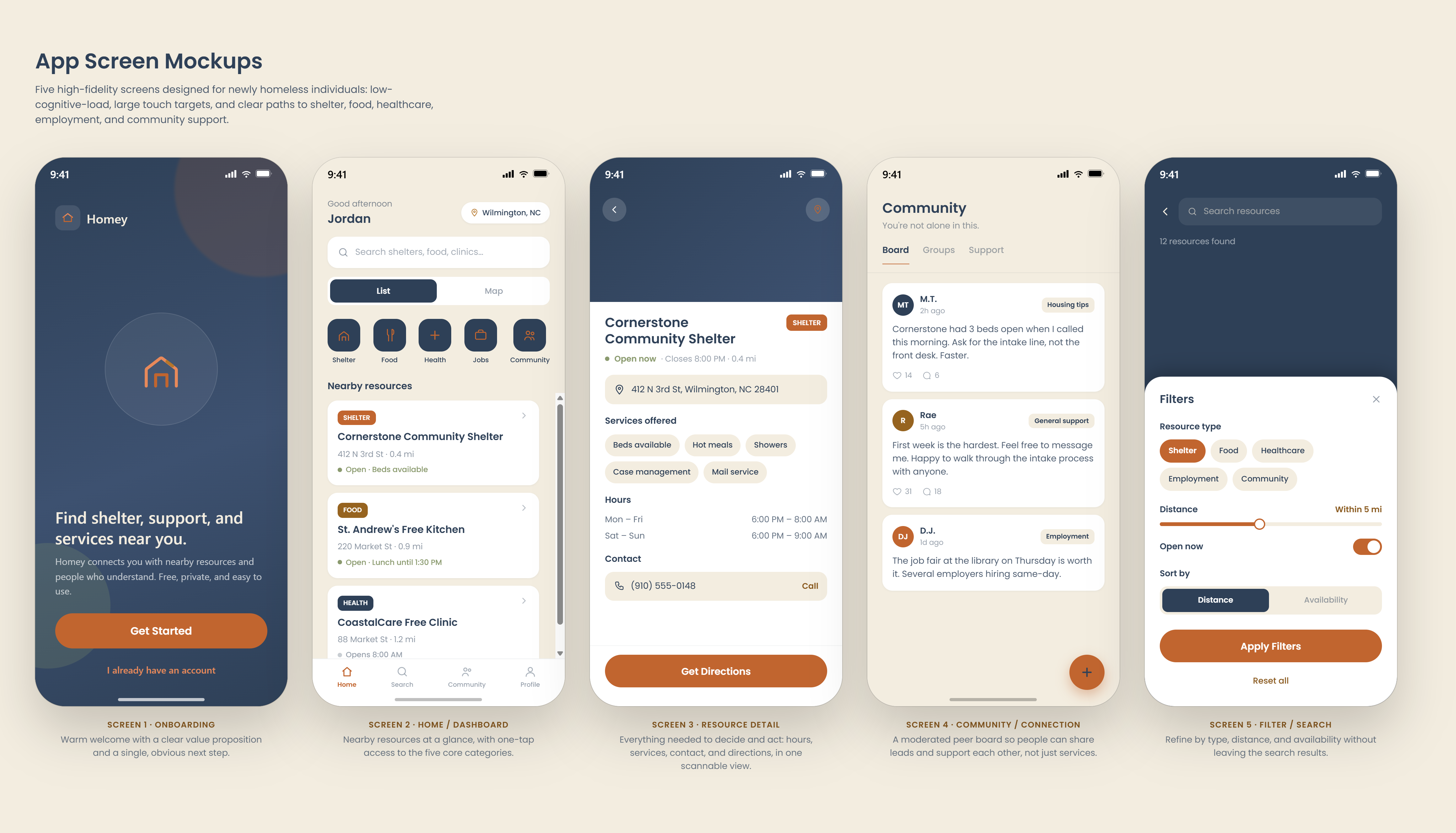
The interface was designed around two priorities: speed of access and visual clarity. We used a light color palette anchored by white, light gray, and a rich green accent to create a calm, approachable experience. The most critical resources were surfaced first, and interactions were kept as intuitive as possible to reduce cognitive load for a user who may be under significant stress.
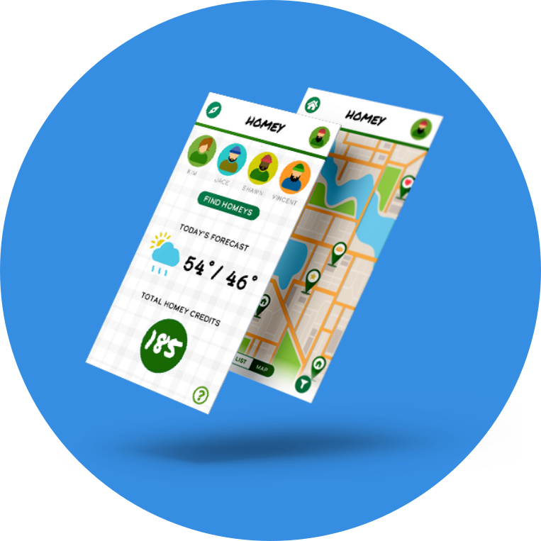
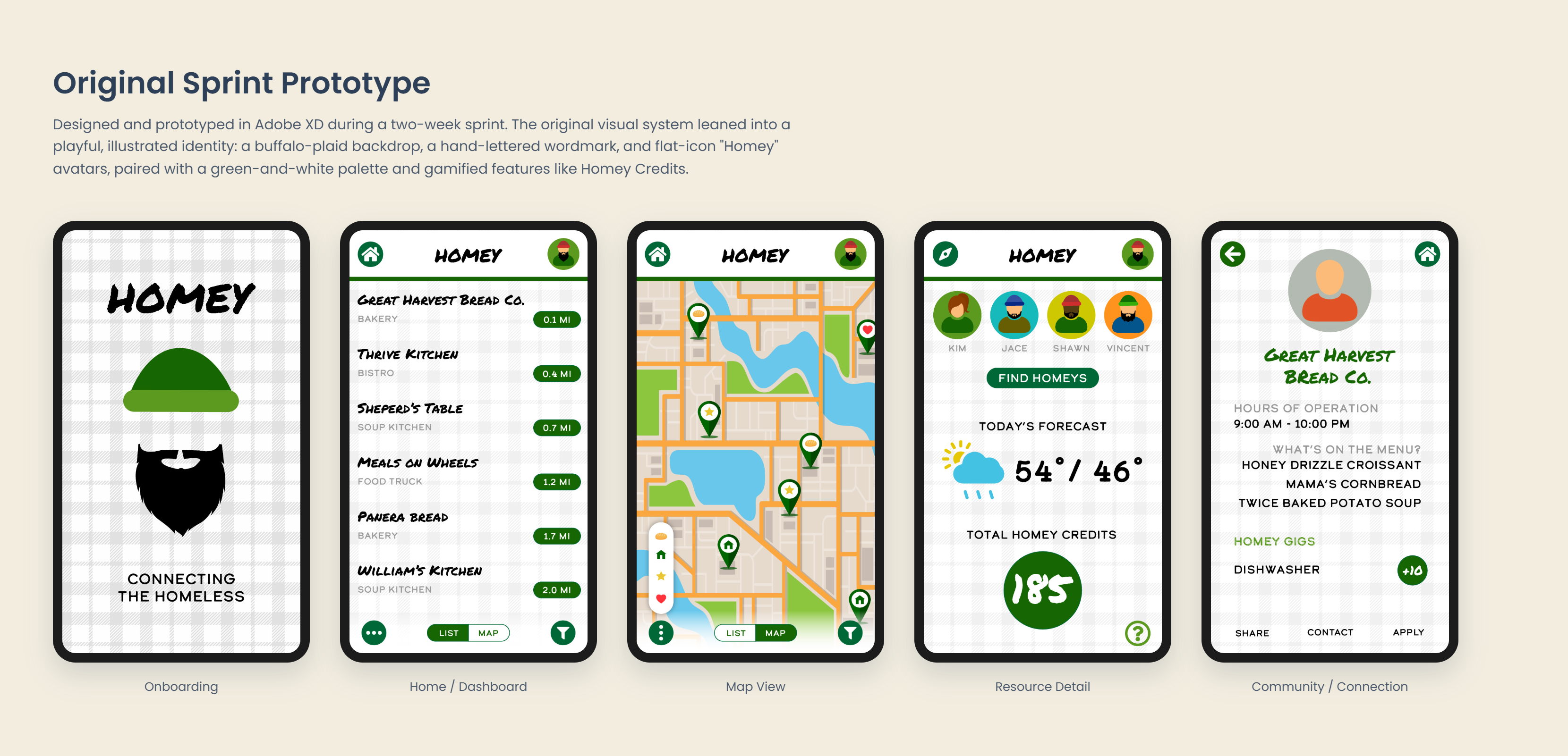
Given the two-week timeline, we focused the design on the most essential screens rather than attempting to cover every possible user flow. Four screens were produced, covering the primary experience of a newly homeless individual locating nearby services.
Prototyping
With the core screens designed, we connected them into a prototype to demonstrate the primary user flow and key interactions. The prototype focuses on the experience of locating and navigating to essential services, which we identified as the most critical path for the target user.
Given the constraints of the project, this remains a first iteration. There is meaningful room to build on: extending the prototype, designing micro-interactions, conducting proper user testing, and eventually moving toward development. The concept itself is one worth continuing.
View prototype
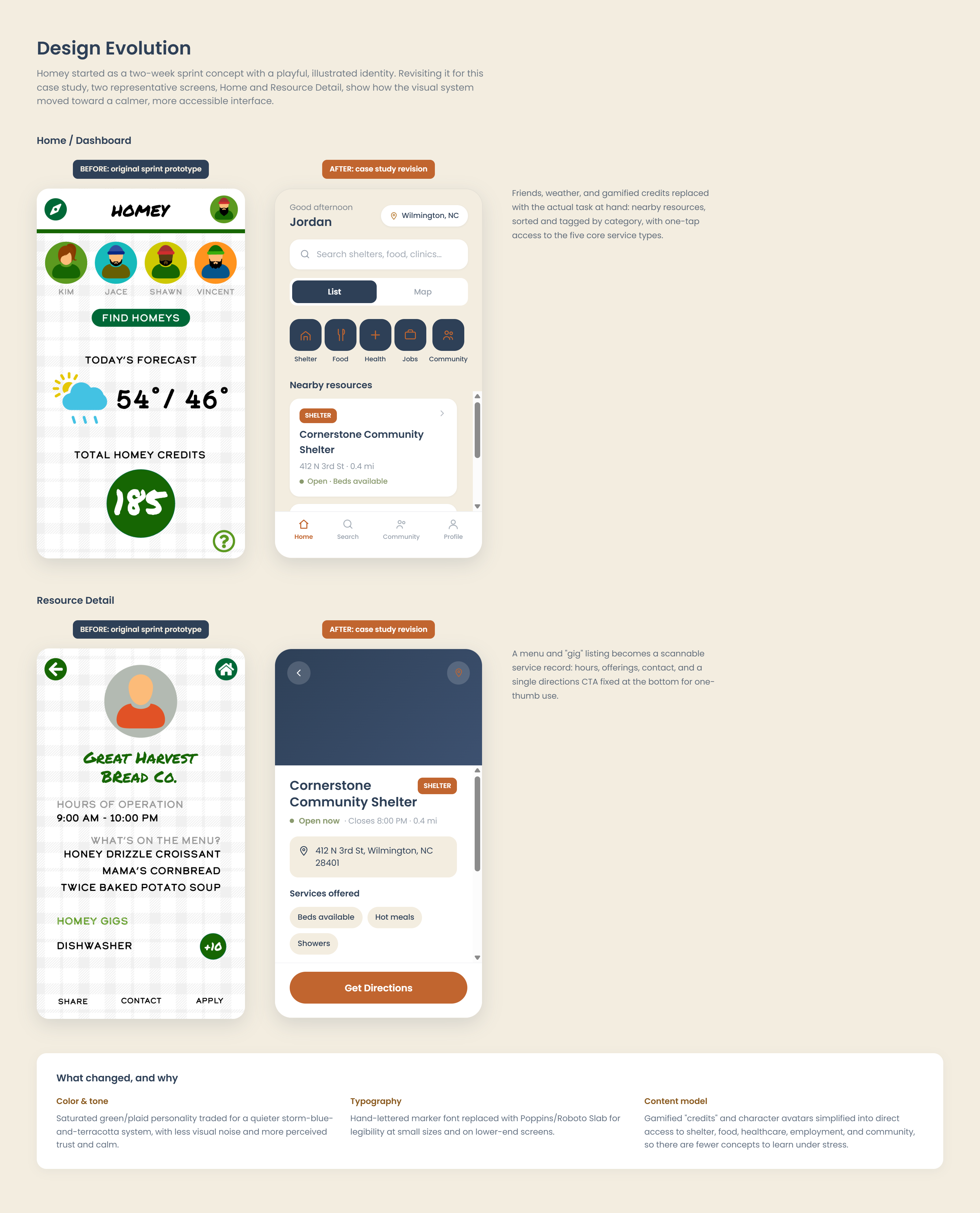
From Playful to Purposeful
The original screens were built in two weeks, and it shows: functional, but unrefined, dressed in a playful palette better suited to a game than a moment of crisis. Revisiting the interface meant keeping the core idea intact while raising the level of craft and rethinking the tone entirely, a calmer palette centered on trust and care, clearer hierarchy, and interactions that feel less like a sprint prototype and more like a real product. The screens below show that shift side by side.