Website Redesign

To accompany the brand new portal system, NCJUA/NCIUA IT management decided it was time to redesign the organization website as well to create a consistent visual system and improved user experience.
tools + languages
Adobe Photoshop, Adobe Illustrator, Microsoft Visual Studio, GitLab, Bootstrap, HTML, CSS, JavaScript, ASP.NET Web Forms
project duration
3 months
Visit website
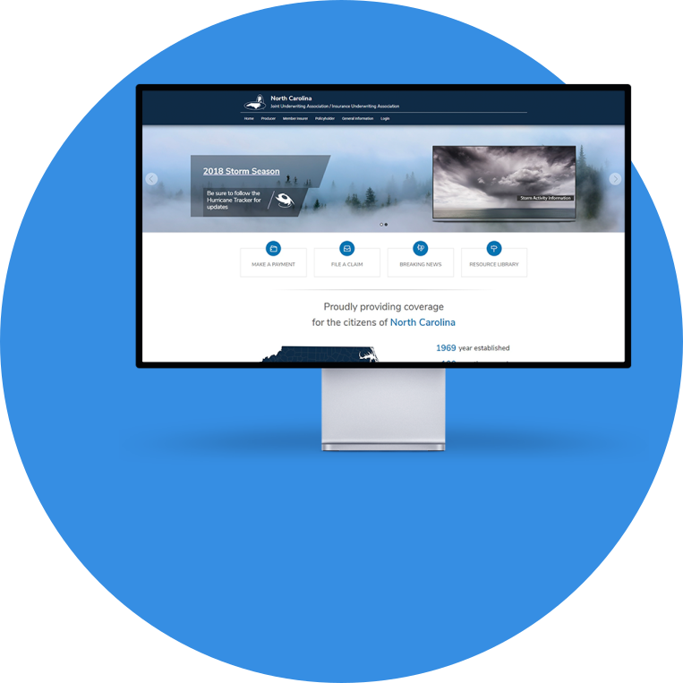
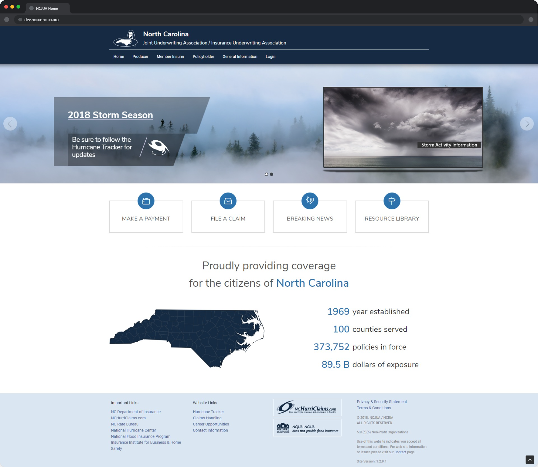
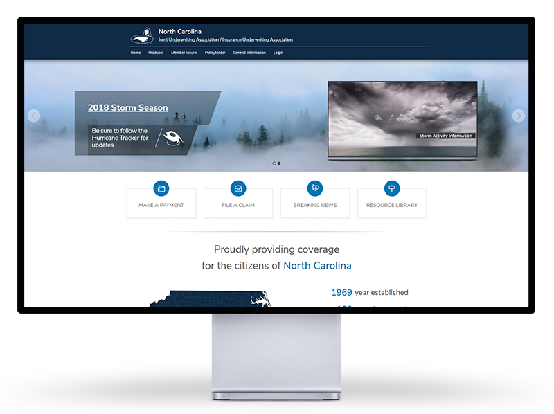
The home page of the NCJUA website displayed on an Apple Pro Display XDR mockup.

The Opportunity

Redesign the Associations' Website
The design of the NCJUA/NCIUA website went unchanged for many years. As progress began on developing a new portal system for producers and consumers, the organization decided that it might be time to update the website as well. The primary requirements were that it maintain consistency with the new system, and it needed to retain all content from the original website.

The Solution

Design and Develop a Clean, Modern Website
The new website, built from a general Bootstrap template, was implemented using ASP.NET Web Forms. The redesign approach focused on four areas: increased usability, consistent and clean interface design, improved site architecture, and centralization of key information.

The Process

01
Identify Shortcomings
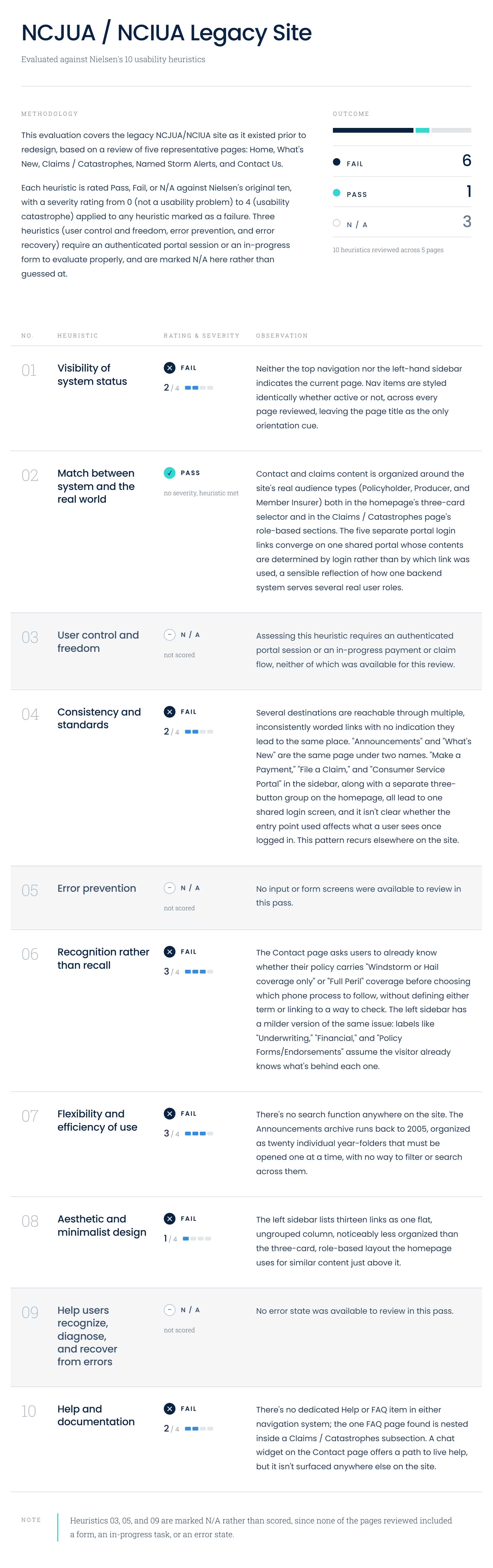
The NCJUA/NCIUA website had not undergone a major update in years. The design was dated, content was difficult to find, and the information architecture did not reflect how the Association's various user groups actually interacted with the site. A Bootstrap theme had already been selected and purchased before I joined the project, but significant work remained in terms of customizing the design, organizing the content, and building a structure that served the site's diverse audience.

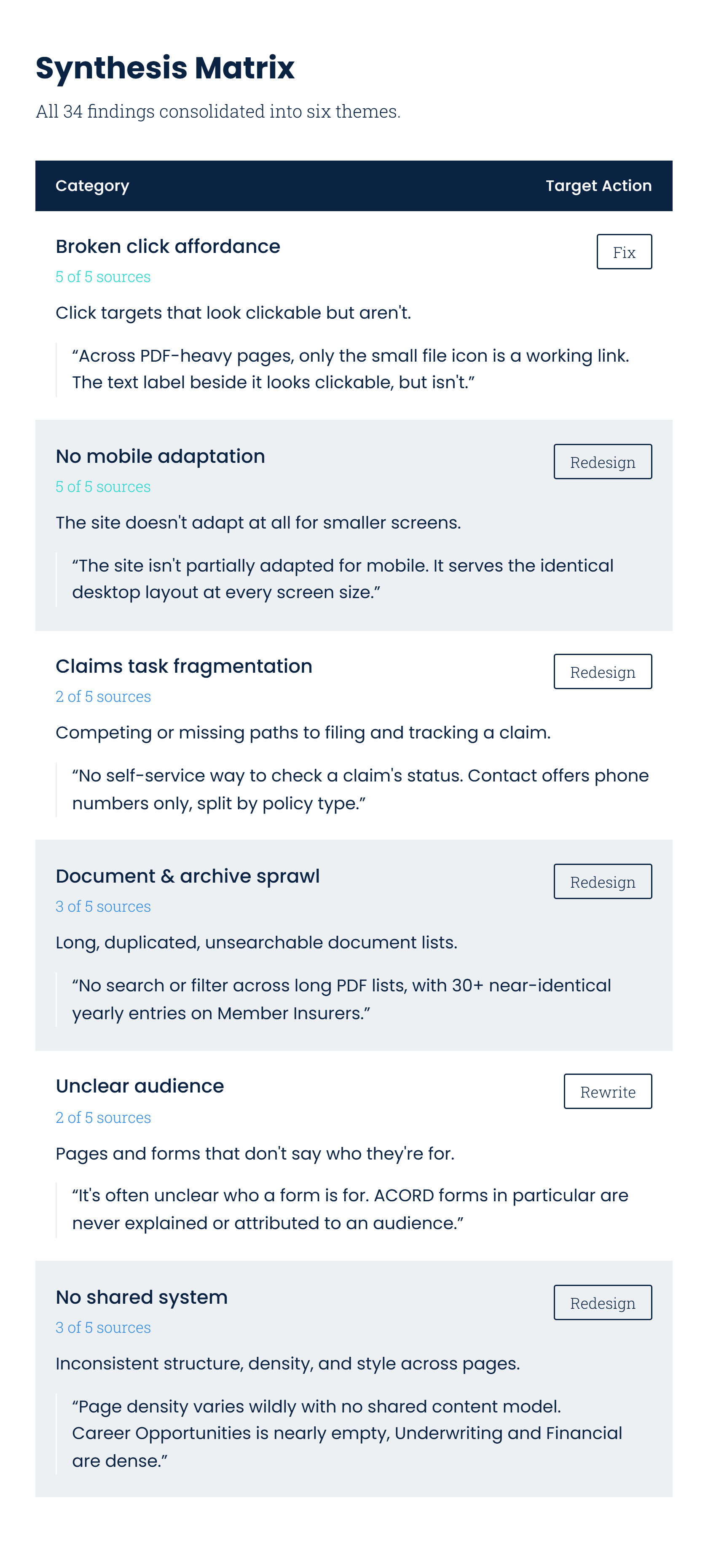
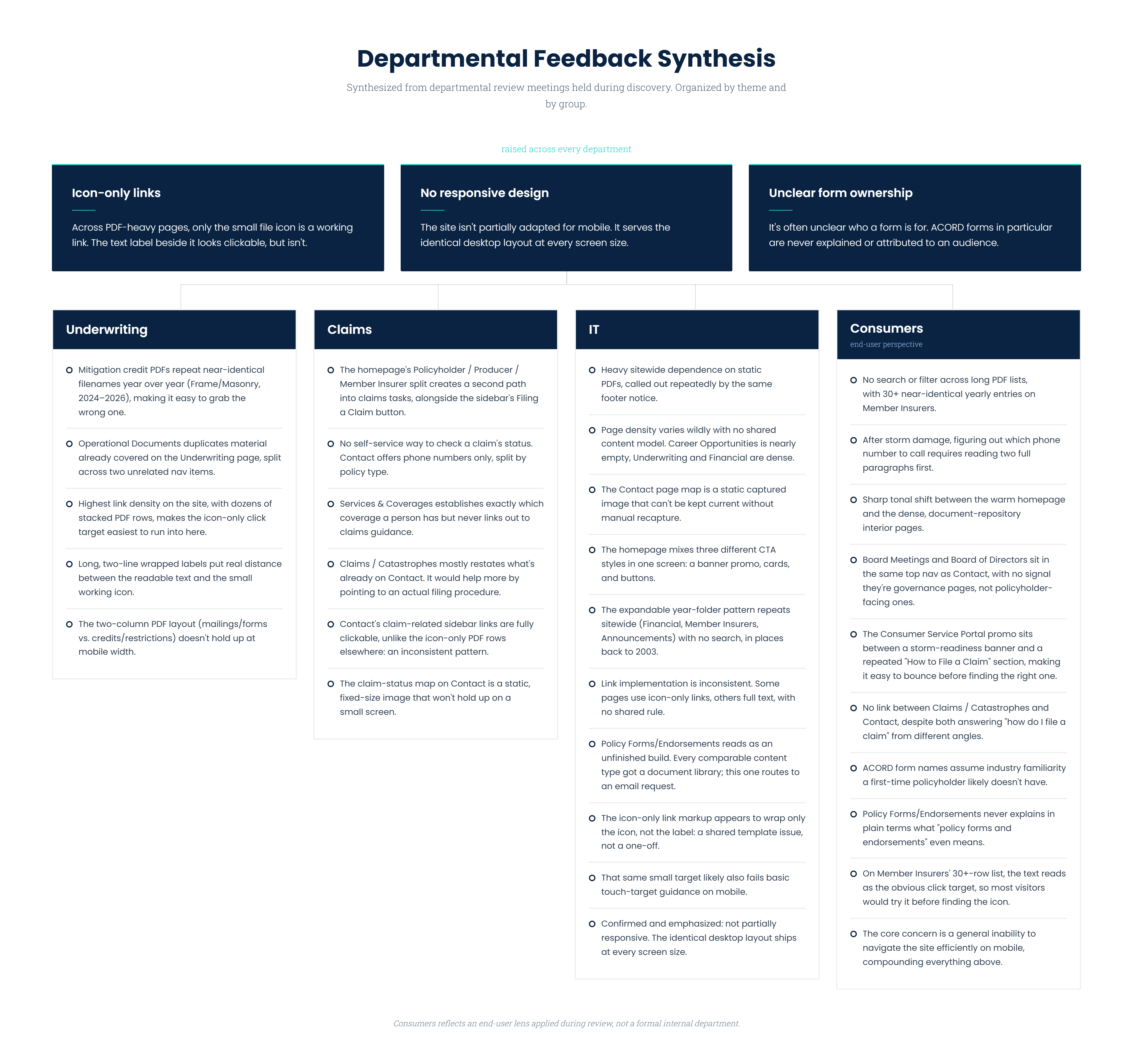
To understand the scope of the problem, I facilitated meetings with each of the Association's internal departments. Each department plays a direct role in communicating with a specific segment of the website's users, including policyholders, producers, member insurers, and others. While the feedback was indirect, drawing from departmental knowledge rather than direct user research, it gave us a clear picture of where the current site was falling short and what each user group needed most.

02
Brainstorm Simplified Structure
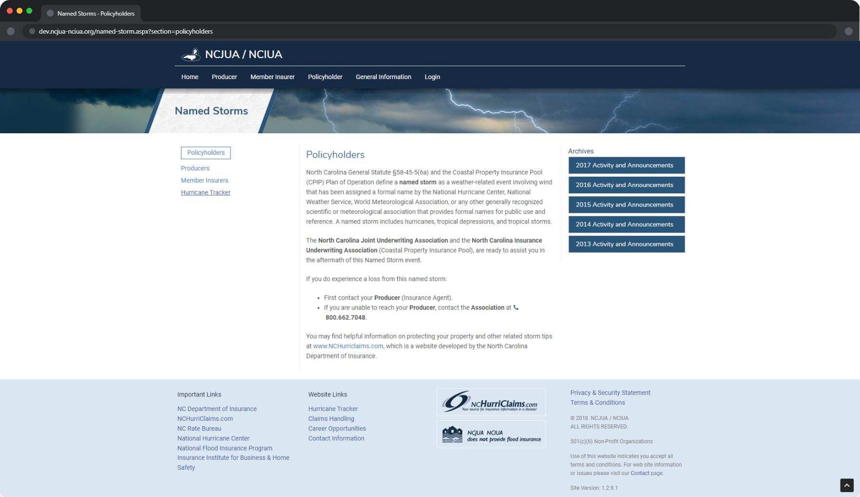
With the departmental feedback in hand, a clear organizing principle emerged: group the content by user type. The three primary audiences were producers, member insurers, and policyholders. Since most of the resources on the site are specific to one of these groups, restructuring the navigation around them immediately made the architecture more intuitive and reduced the cognitive load of finding relevant information.

Leadership also emphasized the importance of surfacing three high-priority actions prominently: accessing the portal, making payments, and filing claims. These are the most frequent reasons users visit the site, so they needed to be immediately accessible rather than buried in the navigation. The portal link was given a dedicated place in the menu, while payments and filing claims were designed as prominent linked cards on the homepage, visible without scrolling.
03
Build and Customize
With the structure defined and approved, I moved forward with implementing the design. The public website was built on ASP.NET Web Forms, a deliberate choice given that the Association's member portal was already built on ASP.NET MVC. Keeping both properties on the same technology stack simplified integration, server management, and the connection points between the public site and the portal, which users needed to access directly from the homepage.

Bootstrap provided the responsive styling foundation. While the purchased theme established the general visual direction, I customized it substantially, adapting the layout, typography, color system, and component design to create a more cohesive and professional experience than the out-of-the-box template would have provided. The result was a site that felt custom without requiring a full build from scratch.
The home page of the NCJUA website displayed on an Apple Pro Display XDR mockup.
04
Prepare for Launch
With the design implemented and content organized, the site was brought to a launch-ready state. All content from the previous version of the website was migrated and adapted to fit the new structure and experience. Visual hierarchy was refined, iconography was added to support content clarity, and the site was tested thoroughly for functional errors across browsers and devices.

The site was not ultimately released publicly, a decision made by organizational leadership rather than a reflection of the project's readiness. The redesign was complete and prepared for launch, representing a significant improvement in usability, visual design, and information architecture over the version it was built to replace.
select a deliverable
01
Content Management App