Brand Identity

A brand identity built for a proof-of-concept geospatial visualizer needed to strike the right balance: athletic enough to feel at home in sports, analytical enough to signal data and intelligence.
tools
Adobe Illustrator
project duration
1 week
View identity
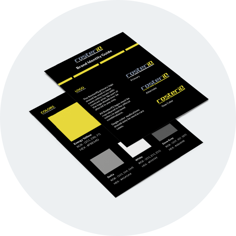
Mockup of the brand identity guide for RosterIQ.

Project Overview

While in the planning phase of the rosterIQ project, I developed a visual system to support the web application and give it a cohesive identity. The system includes a logo, color palette, typography, iconography, and UI components, all designed to reflect the dual nature of the product: athletic and data-driven.

The Elements

01
Logo
The logo served as the cornerstone of the visual system, shaping how every subsequent element was approached.

Before sketching, I generated a list of words to anchor the direction: modern, innovative, map, visualize, intelligence, energy, data, insight, athletic, and motion. From there I began exploring how to translate those qualities into a mark. How do you convey motion? A blur, trailing lines, or an italic slant. How do you signal mapping or data? A chart, a pin, a coordinate.

The result was the brand name stylized as 'rosterIQ' in a typeface that reads as both athletic and modern. Because the visualizer is geospatial at its core, I replaced the tail of the 'Q' with a map marker, a recognizable symbol that ties the logotype directly to its function. A trailing underline was added beneath the wordmark to reinforce the sense of motion.

The National Drug Court Resource Center website, NDCRC.org, displayed on an Apple Pro Display XDR monitor.
02
Colors
With the logo established, I turned to color. While red might seem like an obvious choice for a sports-adjacent brand, I wanted something with more energy and less convention. I landed on Energy Yellow (#FBE64D) as the primary accent, giving the brand a sharp, energetic quality. It was paired with Bali Hai (#8E99AD), a blue-gray that brought an analytical, data-informed counterbalance.

Pure white and two neutral grays rounded out the palette for use across the interface.
03
Typography
The typeface pairing followed the same logic as the color palette: one expressive, one restrained. I wanted a heading font with an athletic character and a body font that would not compete with it.

Bombardier fit the heading role well. Its block-style design reads as athletic without sacrificing legibility at interface sizes. Lato was the natural pairing, simple, modern, and versatile enough to support body text, labels, and UI copy without drawing attention to itself.

The balance between the two is what makes the pairing work. Bombardier carries the personality; Lato keeps things readable.
The National Drug Court Resource Center website, NDCRC.org, displayed on an Apple Pro Display XDR monitor.
04
UI Components
The final step was translating the visual system into interface components. Because rosterIQ is a proof-of-concept with a focused feature set, the component requirements were deliberately minimal: toggle buttons for filtering, a slider for roster year selection, and a handful of supporting UI elements.

Keeping the component set lean was an intentional decision. The map is the product. Every component was designed to support interaction with it rather than compete for attention. Each element draws from the established color palette and typography to maintain visual cohesion across the interface.

Together, the logo, color palette, typography, and components form a system that gives rosterIQ a distinct identity while reinforcing what the product does at a glance.
select a deliverable
01
Web Development