Web Development
Born out of a curiosity about patterns in athletic recruiting and player origins, this solo graduate thesis project sat at the intersection of two passions — sports and data visualization.
tools
HTML, CSS, JavaScript, Leaflet.js, R, RStudio, Geocod.io
Visit rosterIQ
The Opportunity
Explore Relationships and Trends in Athletic Recruiting
Athletic recruiting is relationship-driven and largely opaque. I wanted to explore whether geography played a measurable role in the process, and whether those patterns could be made visible through an interactive web experience.
The Solution
A Web-Based Geospatial Visualizer for Athletic Rosters
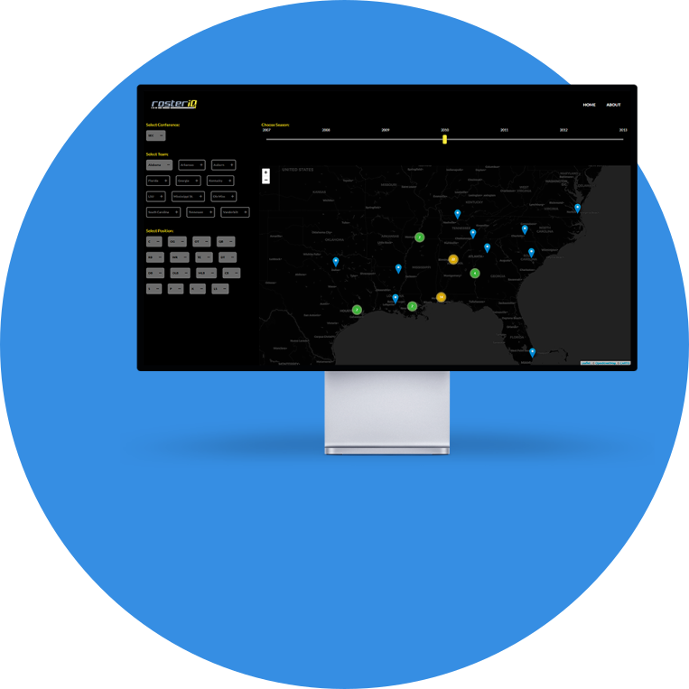
I proposed and built rosterIQ, a proof-of-concept web application that maps the geographic origins of college athletic rosters. The goal was to surface potential relationships between human geography, sports enculturation, and recruiting patterns in a format that was interactive, filterable, and accessible in a browser.
The Process
Define the Scope
With a passion for college football as the starting point, I developed a set of research questions to frame the project. Do certain positions cluster in specific geographic regions? Do coaches recruit based on existing relationships in an area? Are there geographic gaps where undiscovered talent might be found?
From those questions, I scoped a proof-of-concept map-based application that plotted college athletes by hometown. To keep the initial build focused and manageable, I narrowed the dataset to Division I football athletes competing in the Southeastern Conference.
Get and Clean the Data
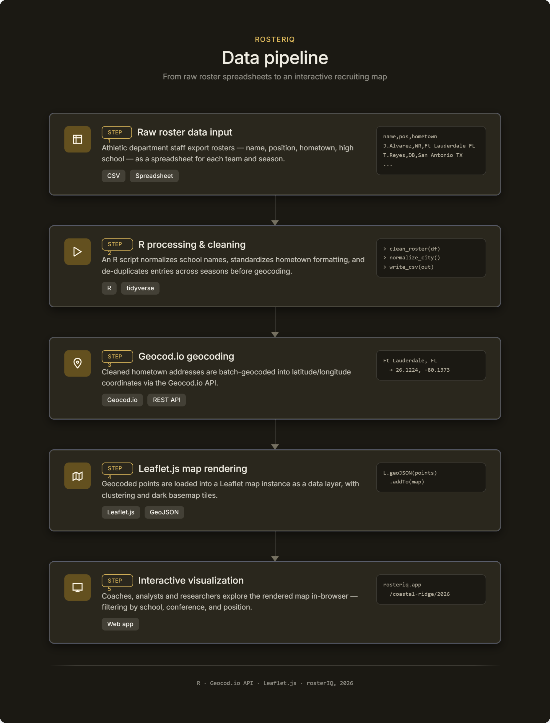
Finding usable data was the first real challenge. After locating a sample dataset with player information across divisions and conferences, including hometowns, I isolated only the SEC athletes I needed.
The most time-consuming phase of the entire project followed: geocoding every player's hometown to obtain latitude and longitude coordinates for map plotting. I used Geocod.io to process the full dataset, then exported the cleaned, geocoded data and prepared it for development. Getting the data right before writing a single line of code turned out to be as important as the build itself.
Design the Interface
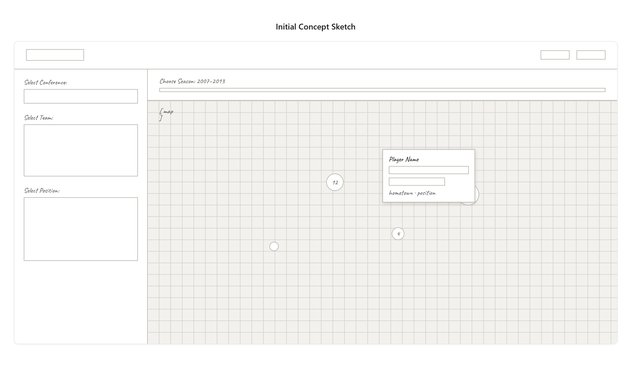
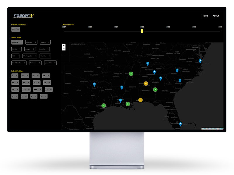
With confirmed access to clean, mappable data, I moved into interface design. After sketching several layout concepts, I settled on a map-centric layout with a filter panel for conference, team, position, and roster year. The goal was to keep the interface uncluttered. The map needed to be the primary focus, with filters as supporting controls rather than competing elements.
Develop for Web
The application was built entirely from scratch using HTML, CSS, and JavaScript, a solo effort from data pipeline to deployed product. After establishing the general structure, I integrated Leaflet.js as the mapping foundation. Its open-source, lightweight footprint made it the right fit for a proof-of-concept at this scale. Marker clustering was added to improve legibility at broader zoom levels.
The most technically challenging aspect of the build was connecting the filter components to the map so that changes in selection updated the visualized data in real time. Getting that filtering logic right required significant iteration.
The completed project was formally presented at a graduate thesis reception and evaluated by faculty. While the proof of concept achieved its core goal of demonstrating that geographic patterns in recruiting data could be visualized interactively on the web, it also surfaced new questions worth pursuing. The project remains one I intend to revisit, with improvements to the data pipeline, expanded conference coverage, and a more refined interface.
Concept, Not Conclusion
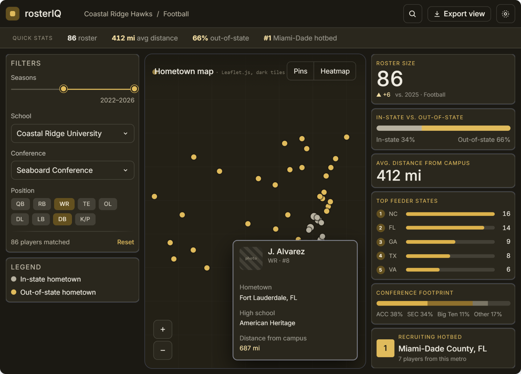
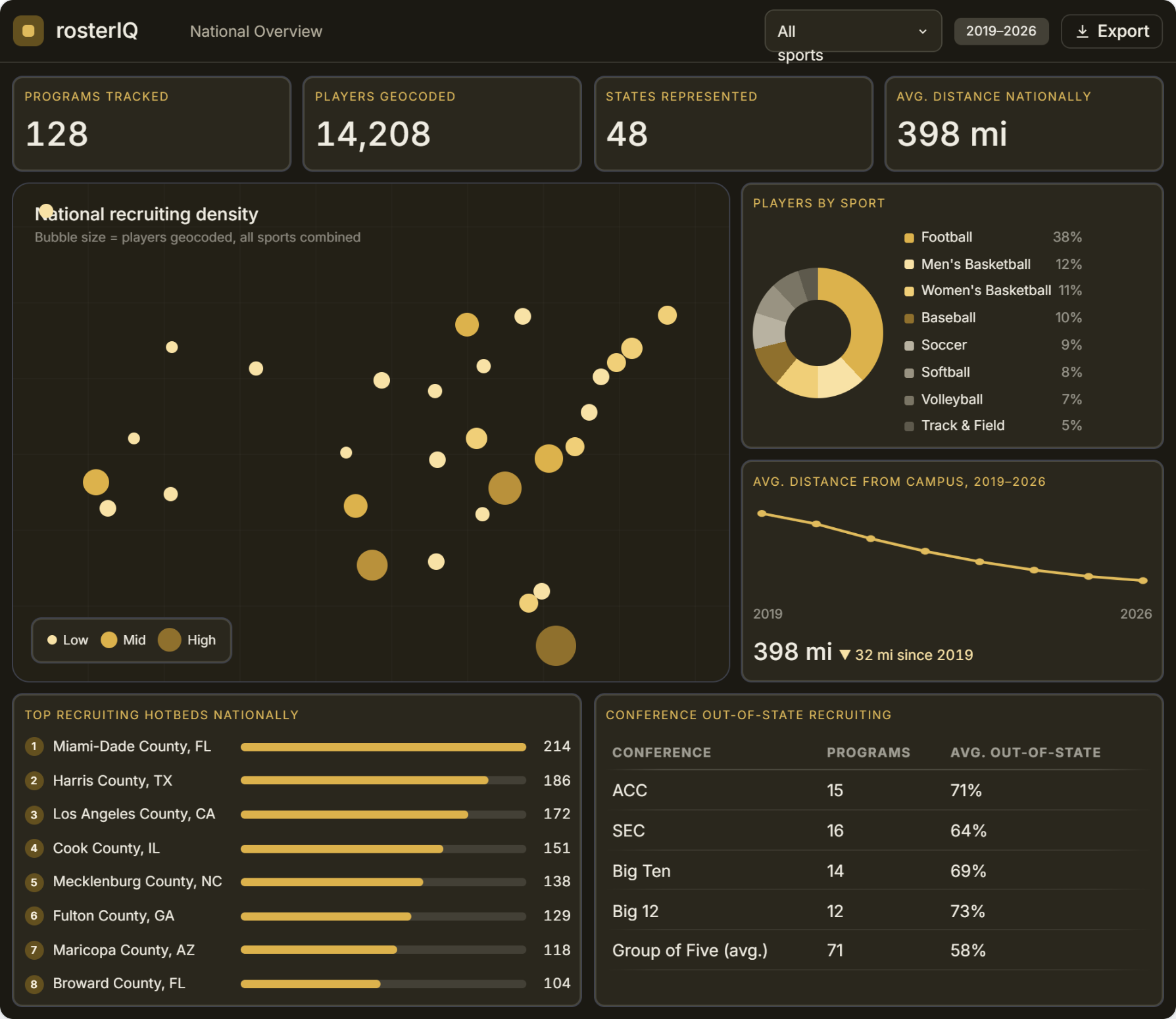
RosterIQ answered its thesis question over three months as a graduate research project. The next version is where it becomes a real tool: a clearer interface built around how coaches and analysts actually explore roster data, a modernized front end in place of the original static build, and a dataset expanded beyond a single sport.