Brand Development
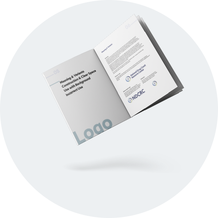
A new institution required a new identity. I developed the NTCRC's visual brand system from scratch in 2020, covering everything from logo and color to stationery, brand marks, and a formal set of brand guidelines.
tools
Adobe Illustrator, Adobe InDesign
project duration
7 months; ongoing
See brand guidelines
Project Overview
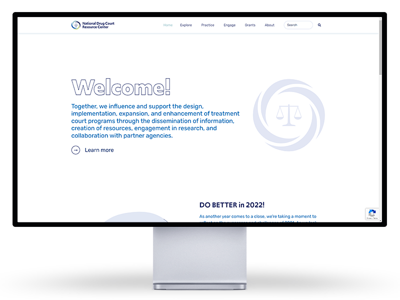
The brand system was developed in tandem with the website redesign, which meant every decision was informed by how the identity would ultimately live on the site. The initial effort produced a 33-page brand guidelines document covering the logo, typography, color palette, stationery, brand marks, and iconography. Version 1.0 gave the organization a clear, consistent framework for branded communications for the first time. The system has grown considerably since then, and version 2.0 is in progress.
The Opportunity
Overcoming a Negative Brand Perception
In early 2020, the communication team learned that the Center's brand was carrying a negative perception among treatment court practitioners. The poor user experience of the inherited website had eroded trust and reduced engagement with the Center's content. Once the decision was made to fully redesign the website, discussions began around developing an integrated marketing communication plan that would support a positive shift in brand perception. A new visual identity was central to that effort.
The Solution
A New Era, A New Identity
To accompany the redesigned website, I developed a new visual identity system for the NTCRC from scratch. The goal was to give the Center a brand that reflected its mission, its collaborative nature, and its credibility as a federally-funded national resource. What began as a logo redesign and color palette selection grew into a comprehensive brand system that continues to evolve today.
The Elements
Logo
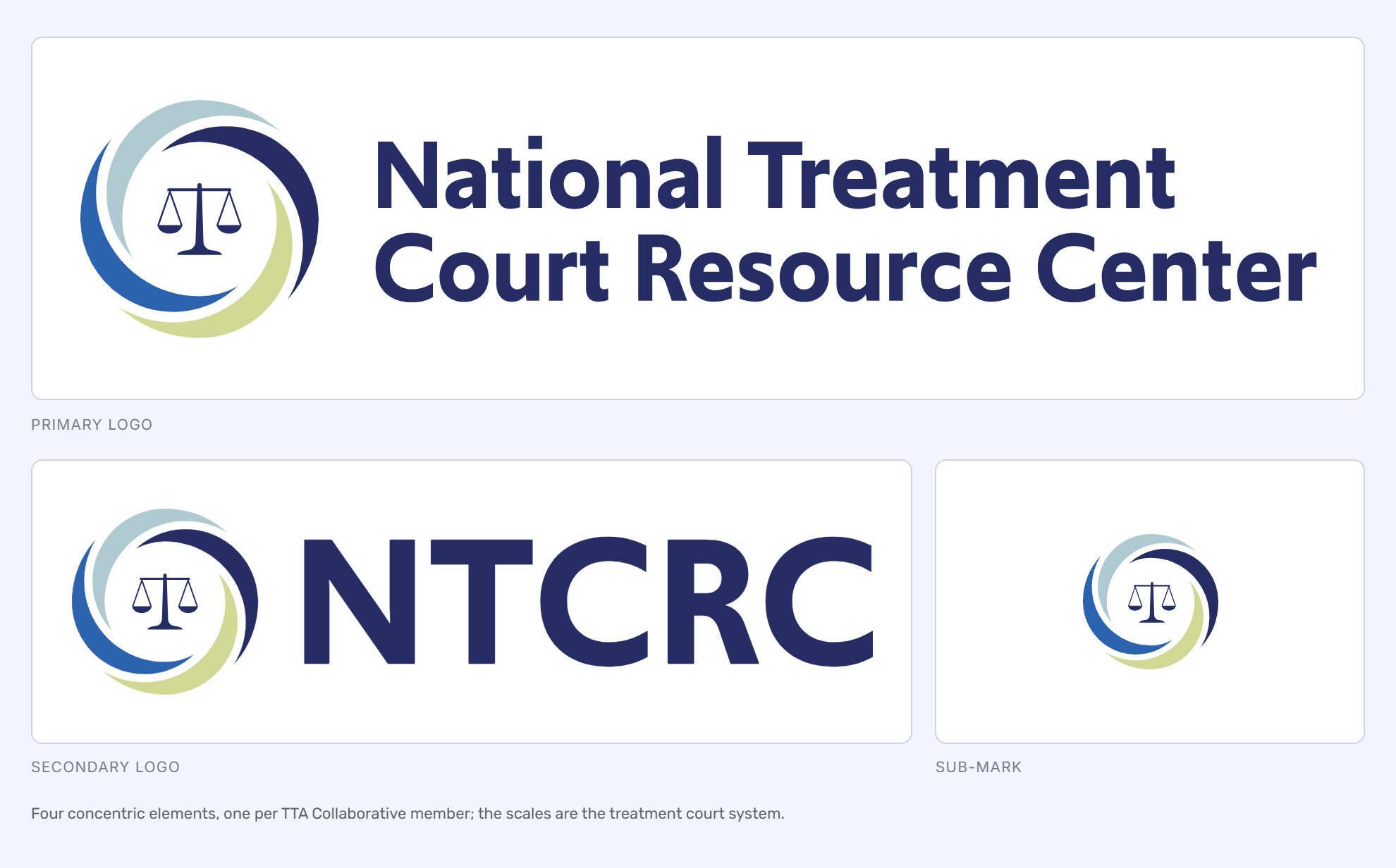
The logo was the foundation for everything that followed. Before sketching, I grounded the design in the Center's core identity: a federally-funded TTA Collaborative partner working alongside All Rise, the Center for Justice Innovation, and the Tribal Law and Policy Institute to serve treatment court practitioners across the nation.
That collaborative nature became the conceptual basis for the visual mark. The submark consists of four concentric elements, each representing one of the four TTA Collaborative member organizations, with the scales of justice at the center as a symbol of the treatment court system itself. The logotype is set in Upgrade Semibold and paired with the submark to form the primary logo.
The identity system includes a primary logo, an abbreviated logo using the 'NTCRC' logotype, and a standalone submark, each designed to serve different use cases across print and digital applications.
Colors
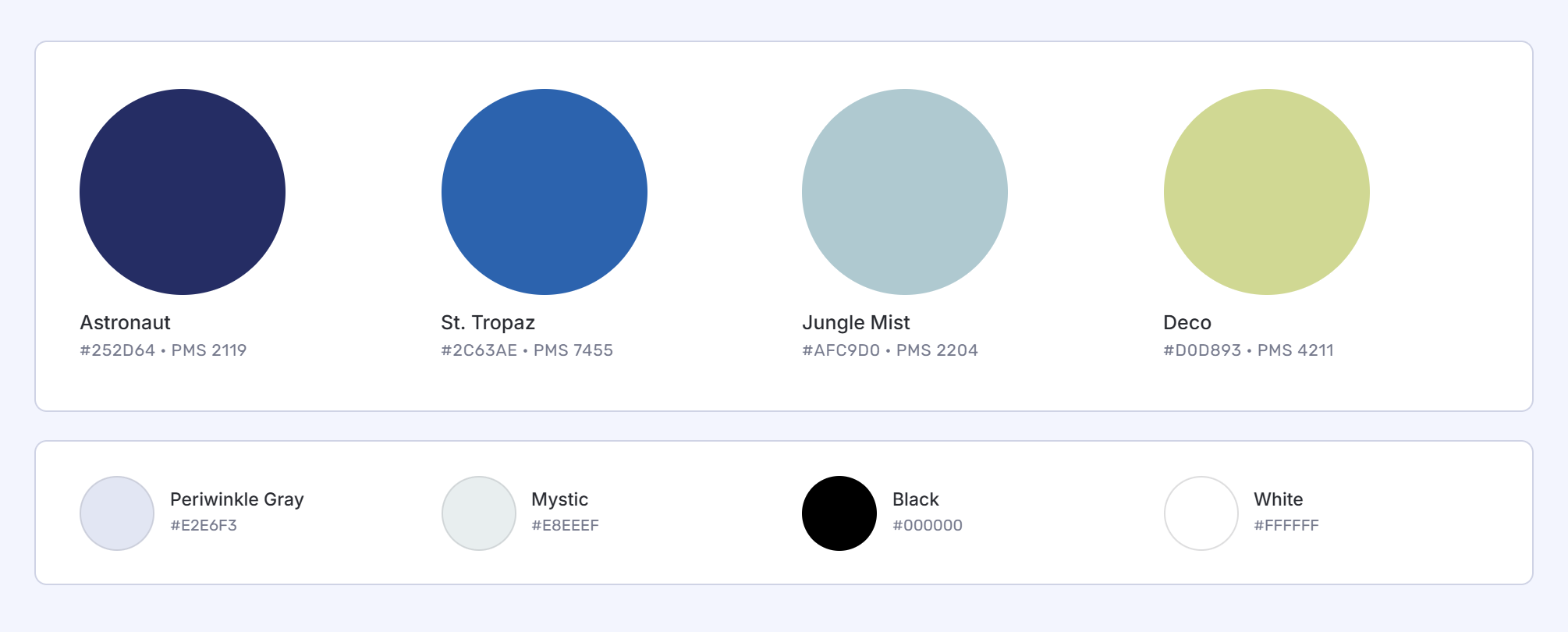
The color palette was developed to reflect both the credibility of the organization and the meaning behind its work. Astronaut (#252D64), a deep navy, represents the firm belief and trust the Center has in its mission. St. Tropaz (#2C63AE), a vibrant traditional blue, represents the Center's TTA Collaborative partners. Support colors including Periwinkle Gray (#E2E6F3) and softer neutrals provide flexibility for use across backgrounds, section dividers, and interface elements.
The palette has been refined and simplified over time as the brand system matured, with the three primary colors now carrying the majority of the visual weight across the website and publications.
Typography
Two typefaces were selected and approved for use across all NTCRC branded materials. Upgrade Semibold serves as the heading typeface, providing a strong, modern presence appropriate for a national organization. Rubik, available across Light, Regular, and Medium weights, handles body copy, navigation, and supporting text. Its slightly rounded corners give it a friendly, approachable quality that balances well against Upgrade's more assertive character.
Fallback typefaces were also defined in the brand guidelines for situations where the primary fonts are unavailable, ensuring brand consistency across all staff and contexts.
Stationery
The stationery system brought the visual identity into the day-to-day communications of the organization. It included a branded letterhead, two standardized email signature options for staff use, and business cards designed for use at conferences and external meetings. Guidelines were also established around what should and should not be included in email signatures to ensure consistent, professional representation of the Center across all outbound communication.
Brand Marks
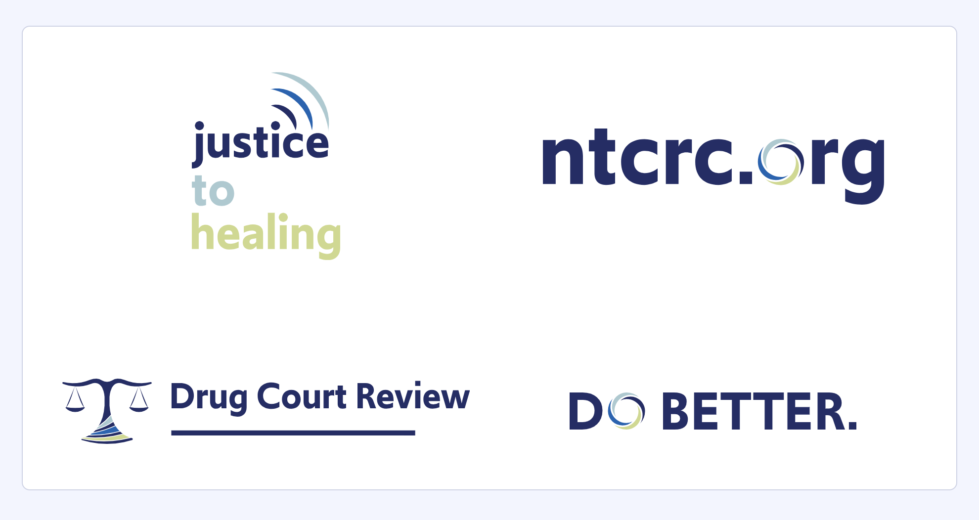
Beyond the primary logo, a suite of brand marks was developed to support the Center's growing portfolio of programs and initiatives. These include the Justice to Healing podcast wordmark, available in stacked and horizontal formats; the Drug Court Review journal mark in two styles depending on whether a specific volume is being referenced; the NTCRC tagline mark reflecting the Center's four areas of focus: Disseminate, Collaborate, Research, and Create; the NTCRC.org wordmark; and the Do Better campaign mark, launched in Spring 2021 to emphasize the importance of collective and self-improvement.
Each mark was designed to be visually consistent with the primary identity while serving its own distinct purpose. Color assignments were carefully specified in the brand guidelines and are not to be altered.
Foundation, Not Finish Line
Six years of publications, digital products, and communications later, the foundation built in 2020 is still holding. Version 2.0 is the next chapter, not a correction.