JDTC Dashboard

The JDTC Dashboard is a web-based tool developed for All Rise and the Center for Justice Innovation, allowing stakeholders to explore key data about Juvenile Drug Treatment Court programs across the United States. I was appointed to lead the project from start to finish, with responsibility for the dashboard interface design and development.
tools
ArcGIS Experience Builder, ArcGIS Pro, D3.js, Microsoft Visual Studio
project duration
6 months (initial) + ongoing
Explore dashboard
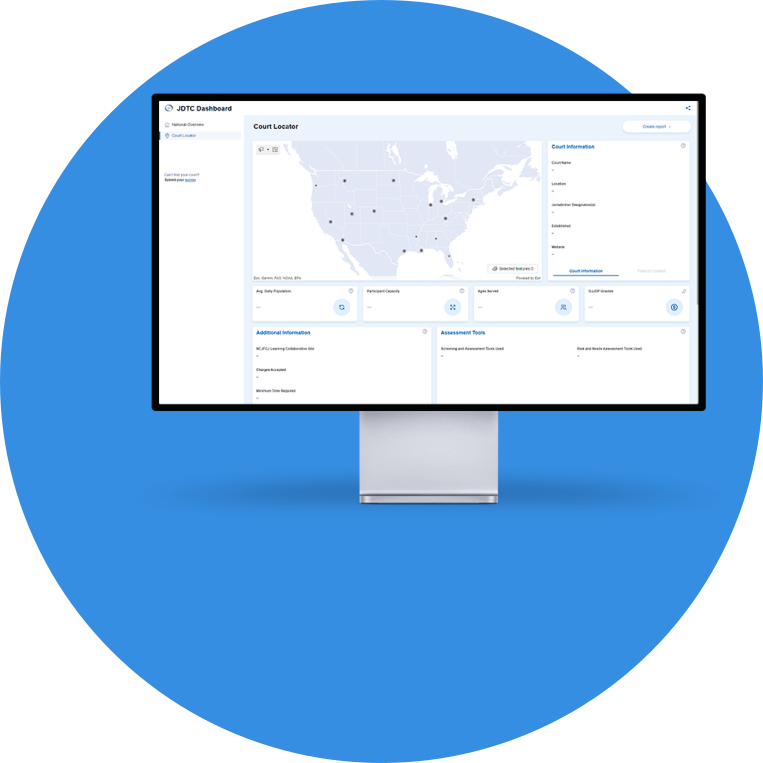
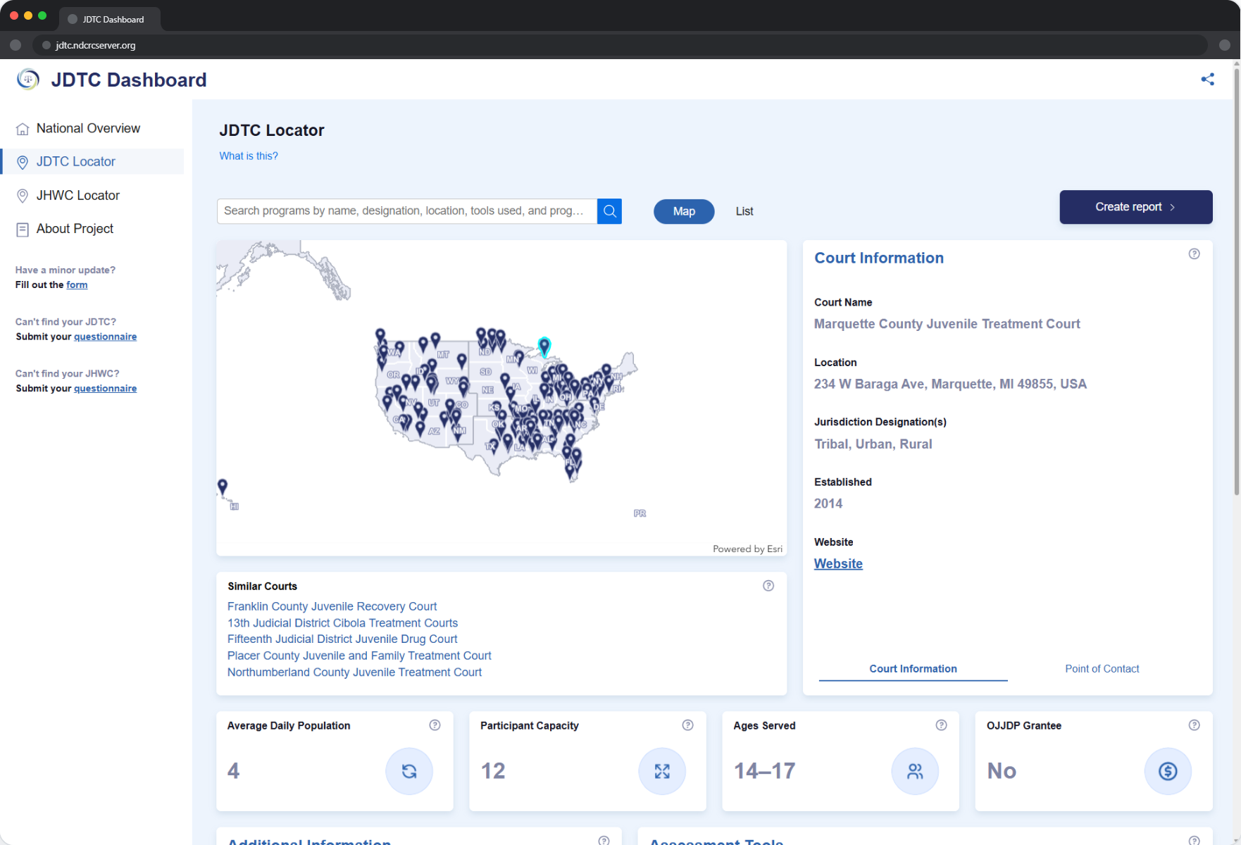
The court locator page of the Juvenile Drug Treatment Court dashboard displayed on an Apple XDR monitor.

The Opportunity

A Web-Based Tool for JDTC Program Data
In the summer of 2021, All Rise and the Center for Justice Innovation conducted a national survey of juvenile drug treatment courts. With guidance from the Office of Juvenile Justice and Delinquency Prevention, the collected data needed to be made accessible through an interactive, map-focused web tool. Recognized for my work in data visualization, the NTCRC co-directors appointed me to lead the project.

The Solution

A Map-Driven Dashboard Built to Grow
Working with a small team, I designed and developed a map-driven experience using ArcGIS Experience Builder that highlighted fourteen required data points as defined by All Rise and the Center for Justice Innovation. The initial product met every project requirement and set a foundation for continued expansion. The dashboard remains active and is still being developed today.

The Process

01
Defining Goals and Requirements
The first step was meeting with the clients to define exactly what they needed. The primary challenge was to give juvenile drug treatment court practitioners a way to find and compare information about JDTC programs across the country, helping them identify ways to strengthen their own programs. The tool would also serve as a directory of points of contact within each program.

OJJDP set two non-negotiable requirements: the solution had to be map-focused, and it had to surface fourteen specific data points collected during the survey period. Everything else was open for exploration.
02
Brainstorm Ideas
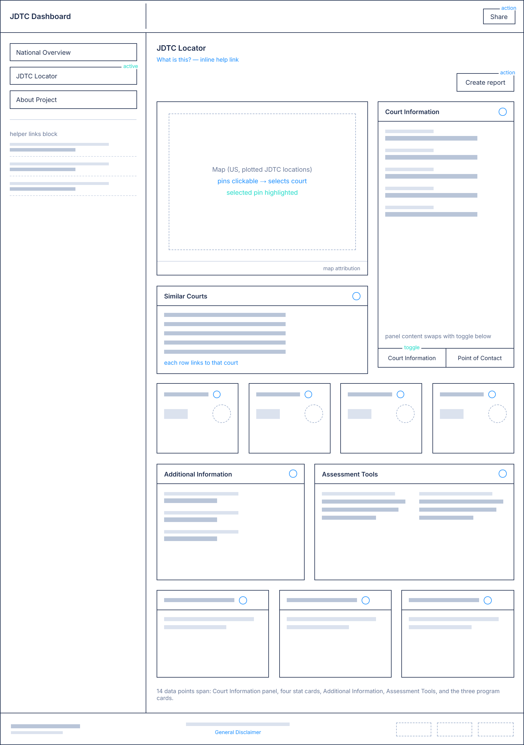
With the requirements clearly defined, I began sketching layout concepts for how the information could be organized around the map. The chosen direction consisted of three content rows. The first contained two blocks: one for the map and one for toggling between general program information and point-of-contact details. The second row featured four cards highlighting key data about program population and funding. The third row presented the remaining data points in a single consolidated block.
03
Create High-fidelity Mockup
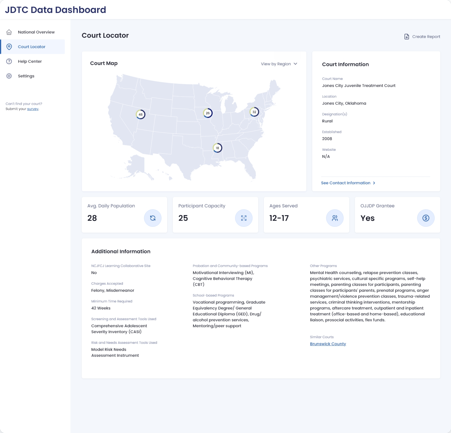
Moving into a static high-fidelity mockup allowed me to work through design challenges like component design, visual hierarchy, and functionality in more detail. Several elements that had not yet been considered worked their way into the solution at this stage, including tooltips for variable definitions and supporting iconography.

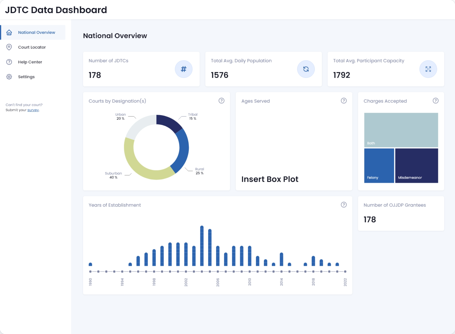
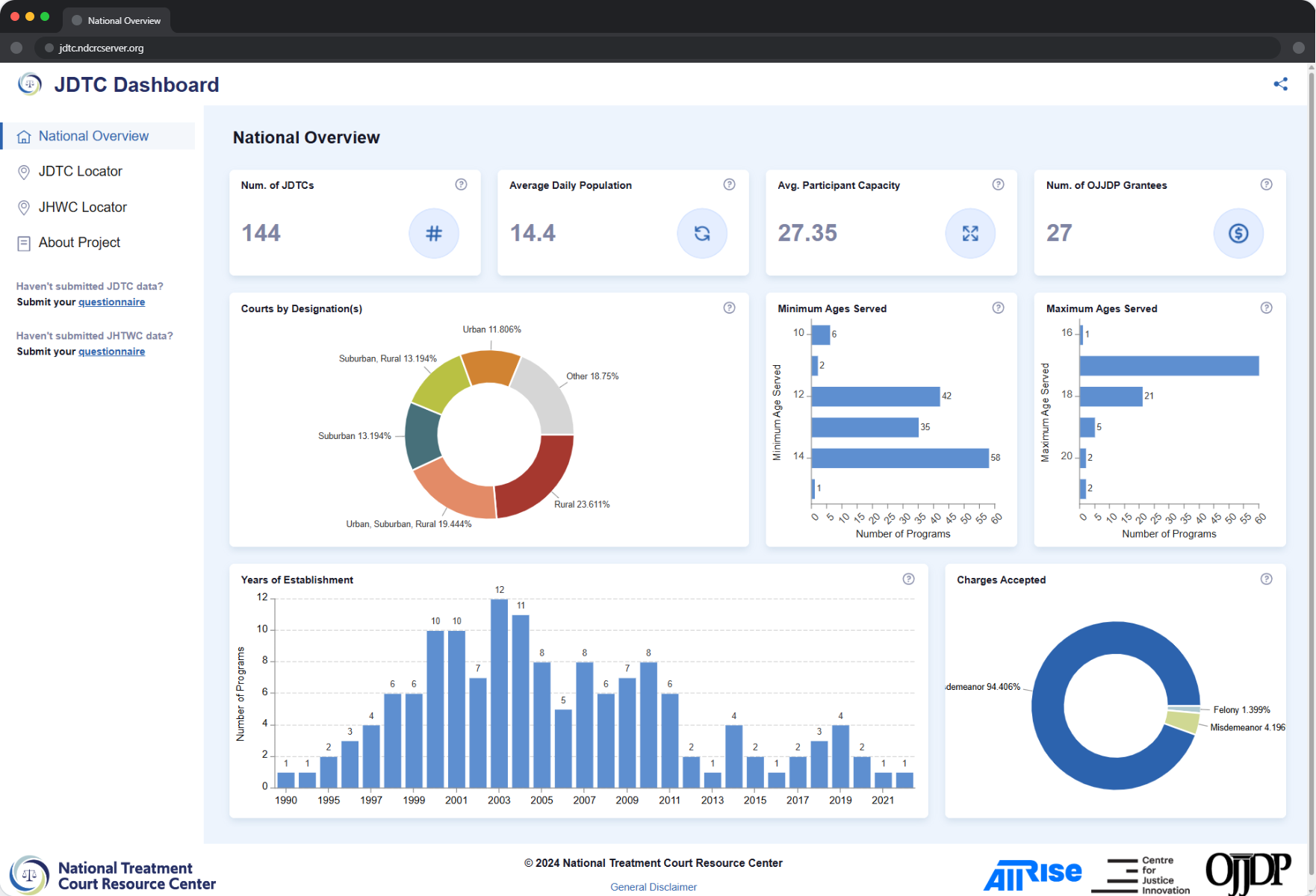
An additional requirement also emerged during this phase: a data export feature that would allow users to select and filter data for download in their preferred format. I incorporated this into the mockup alongside an initial design for a national overview page, which used charts and summary blocks to give users a high-level picture of JDTC data across the country.
04
Research and Select Development Tools
Choosing the right tools for a project of this complexity required careful research. Previous dashboard work at the NTCRC had been built in PowerBI, but PowerBI is not map-focused and offers limited interface customization. After evaluating alternatives, I proposed ArcGIS Experience Builder, a relatively new platform from Esri that provided a strong foundation for map-driven interface development.

I opted for the Developer Edition specifically, which allows for custom widget and theme development and offered the most flexibility for the long-term vision of the product. Microsoft Visual Studio served as my IDE throughout the development process.
05
Build and Launch
With the toolset confirmed, I moved into development. The dashboard interface was built using ArcGIS Experience Builder, with D3.js initially used to power the charts and visualizations on the national overview page. As ArcGIS expanded its native charting support over time, the D3.js implementation was replaced with native components, simplifying the codebase without sacrificing functionality.

The maps featured throughout the dashboard were developed by other members of the team, while the dashboard interface design and development was my responsibility end to end.

At launch, the dashboard met all fourteen required data points and delivered a map-driven experience that All Rise, formerly NADCP, was more than pleased with. Since launch, the dashboard has been expanded to include a tribal-focused Juvenile Tribal Healing to Wellness page, reflecting the growing scope of the project. Data updates are maintained on an ongoing basis, and a similar courts feature currently in testing will allow users to select a program from the map and surface comparable courts based on shared attributes. It is a meaningful addition to the tool's analytical capability.

Custom widget and theme development remain on the roadmap, pending further funding. The project continues to evolve.

select a deliverable
01
Website Redesign
02
Brand Development
03
Publications